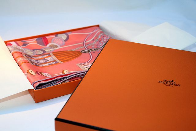
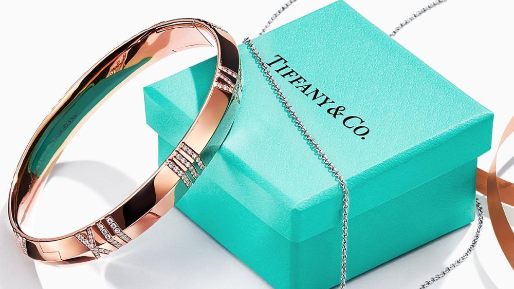
If you’ve ever received the Hermès orange or the Tiffany blue box, chances are that you were as excited to see the box as you were to unwrap and reveal what it concealed. Even more certain is the fact that, somewhere in your closet or on a storage shelf in your home, the box sits majestically in front row, housing its original content or some other product considered just as worthy.

Researchers at Basel University in Switzerland have conducted a study to find out why this is so. The research set out to discover the relationship price and packaging had with consumers’ perception of a wine’s quality.
The results are eye-opening.
140 volunteers, split into three groups, were given three different low-, mid- and high-priced wines to taste. All wines were 2013 Italian reds but while one was a $70, highly-rated bottle, the other two were an acceptable $40 vintage and a $12 vino de Tavola.
The first group was accurately informed of the price of each wine. The second group had no idea of prices. The third group was informed of prices; however, the researchers switched the costs, making the cheapest wine more expensive than the more pricey bottle of wine.
The result? Volunteers in the first group gave higher points in the quality and pleasantness category to the more expensive wine. The second group considered all three wines equal. The third group however rated the $12 wine the best even though they did not rate the high-priced wine badly either. In fact, its ratings did not change even when its price did.
What does this mean for luxury brands?

While the quality of a product is important and will speak for a brand, it is its price, packaging and overall experience that will determine just how the final consumer will perceive it.
The link between cost and quality can be more sleight of hand than most of us would like to admit. But the dynamic goes well beyond the suggestive power of price. Luxury goods are presented to us through a prism of savvy marketing, with brands deploying an array of tricks—from label design to colour selection and even upcycling—to help subconsciously suggest their products are first class.
The colour of luxury
A spare, uncluttered aesthetic—whether logo or label—is one established luxury trope. It’s carried over into online design: Consider how Amazon retains such busy, cluttered pages, a subconscious suggestion that its products are the cheapest around (there’s no basis to believe that anymore, of course).

The bright colours of Amazon and co are also a discount signal, per Artur Obolenski, who works on luxury packaging for the Warsaw, Poland-based Packhelp. Every day, or value, brands will often opt for primary shades of yellow and red; darker colours are synonymous with luxury. Look at lab tests tasking volunteers to drink coffee and rate it, he notes. “When you pour it into different coloured cups and ask customers to assess it, they put a higher price on what they drink from navy blue, black or brown cups than from yellow or red ones. They also consider it more delicious.”
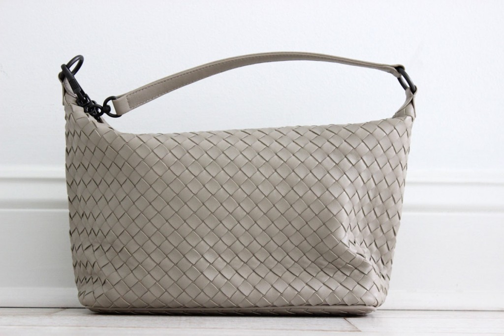
If they don’t default to a dark shade, luxury brands might instead aim to establish a signature colour—perhaps even registering it with Pantone (see Tiffany blue, or Hermès orange, for example). Consultant Lisa Pomerantz has expertise in this, having worked on such a program while a senior executive at Bottega Veneta. She helped shepherd the development of a new brown—taupe, to be precise—that would be its non-verbal calling card. “The average consumer may not see that it’s custom, but you want to create something that no one else can copy,” she tells says. In other words, pick a colour that’s complex enough that it’s costly for copycats to profitably replicate en masse.
Pomerantz also spent time at Michael Kors known for a signature khaki developed for the designer by famed art director Fabien Baron. “It’s so beautiful, but when the company went public, and we had to explode financially, I can’t tell you how many times we tried to replicate that khaki for different end uses,” she says, of websites, shopping bags and hang tags, “But it was impossible to do, and to maintain budget.”
The rise of reusability
Luxury packaging, Pomerantz continues, is often intended to be reused—not recycled, but rather retained by a customer and redeployed. Look at online fashion boutique Matches for example; Pomerantz herself has a towering pile of the heavy cardboard boxes used for delivery in her bedroom. British luxury grocer, Fortnum & Mason sells its comestibles in collectible tins.

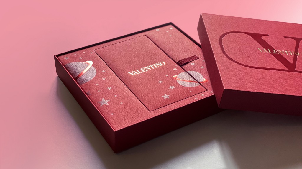
One giveaway that a box is intended to be retained not recycled? Magnetic closures, says Packhelp’s Obolenski. It’s also more expensive to create 90-degree corners in cardboard, he continues, so only premium brands can afford to budget for crisp edges to their boxes.
Such upcycling also syncs with the need for luxury brands to emphasize sustainability more than ever. Recently, they have come under criticism for the waste they indulge in or encourage, and many are reinventing themselves into more sustainable corporations.
“Luxury [packaging] used to be about having something be over the top, and throwing it away—there was so much waste. Now, it’s as much about function and utility, something you can reuse and repurpose for keepsakes,” says Ashleigh Hansberger co-founder of brand consultancy, Motto.
Source: Robb Report
